The Boston Children's Museum


Boston Children’s Museum
308 Congress Street, MA
177,074 square feet
Built in 2007 / Urban Environment
Architect: Cambridge Seven Associates
Users:
Organization – Boston Children’s Museum
Groups – Children, Parents, Caregivers, Teachers, Students, Tourists, Locals
Individuals – 95 Staff members and 600,000 average visitors annually
Amenities: Traveling Exhibits, Gallery Space, Hands-on-Activities, Child Ergonomics, Collection with 50,000 Ethnographic Artifacts, Event Space, On-site Dining, Beyond the Chalkboard a free after school program, Professional Development
What works…
This site is an excellent representation of interactive exhibit design. It was selected for its similar programmatic requirements in relation to the interactive arts museum in proposal. This facility has excellent uses of color for the age group. The bright, highly saturated colors and playful activities are designed to engage children and expand their mental and social growth through various topics like science and history. Wayfinding methods are utilized to maneuver through the space, particularly the use of landmarks. Helpful when you may have children visitors who don’t read yet.
What doesn’t work…
The Boston Children’ Museum has very few social or group activities, as well as solitary activities for children to incorporate all learning styles. Activities are more focused on the subjects of science and the space is a larger example of this type of facility.
How it relates to my design…
Will provide a space that is open and grand to create an awe inspiring entrance, while incorporating landmarks and graphic wayfinding methods. Will also utilize highly saturated colors to attract attention. As well as sustainable methods similar to this facility.
Children's Museum of the Arts


Children’s Museum of the Arts
103 Charlton Street, NY
11,302 square feet
Built in 2011 / Urban Environment
Architect: Work Architecture Company
Users:
Organization – Children’s Museum of the Arts
Groups – Children, Parents, Caregivers, Teachers, Students, Tourists, Locals, Artists
Individuals – 46 Staff Members and 100,000 average visitors annually
Amenities: Daily Workshops, After-School Camps, Event Space, Fine Arts Studio, Wee Arts Studio, Media Lab, Sound Booth, Clay Bar, Ball Pond
What works…
This facility was chosen for its similar educational aspects and subject matter taught. Bold use of color delineates circulation paths and interactive moments. Clear organizational method around central gallery. Reused existing structure for site and incorporates studio spaces and physical activities.
What doesn’t work…
The Gallery space while a good idea in theory seems unused and a poor idea for younger children that enjoy touching things to learn about them. Less color with a more modern aesthetic creates a colder entry. Unadorned surfaces give a clean almost clinical look.
How it relates to my design…
Combine the use of exhibit spaces with physical activities and studios to create projects and interact with children in various styles of learning. Utilize a more relaxed/ informal gallery space. Create a warmer entry to seem less intimidating to younger users. Give clear indication of each space and its use without limiting its use.
Hallie Brown Ford Fine Arts Center

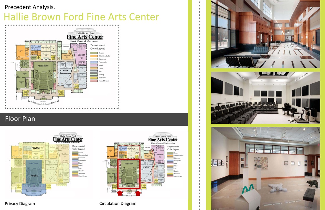
Hallie Brown Ford Fine Arts Center
920 East Main Street, Ada, OK
82,000 square feet
Built in 2009 / Suburban Environment
Architect: Rees Associates, Inc.
Users:
Organization – East Central University
Groups – Children, Adults, Caregivers, Teachers, Students, Artists, Locals, Musicians, Performers, Patrons
Individuals – 5,000 average students annually
Amenities: Performance Hall (seats 1,000); Sculpture Garden; Permanent Art Collection; Departments for: Television/ Radio, Photography, Music, and Art; 3 Multi-Purpose Classrooms; Northern Skylights; Event Space; Costume and Scene Shops
What works…
This facility was chosen because it incorporates multiple aspects of the arts, including music and drama. It is designed to house a large audience in its assembly hall and creates indoor/ outdoor sculpture gardens. Spaces were organized into departments for easy access to materials and resources but this doesn’t create allow for cross pollination of groups. Good design for noise levels and lighting.
What doesn’t work…
This facility is indicated for an older user (college students) and therefore has a more mature environment. The setting would function for a younger audience but would not engage or excite them.
How it relates to my design…
Will provide space to bring the outdoors in and meet with a large group at one time. Allow for different departments and aspects to intermingle with one another while providing spatial and auditory separation. Bring natural light into the space.
Kimball Art Center


Kimball Art Center
638 Park Ave, Park City, UT
30,000 square feet
Projected build date 2015 / Urban
Architect: Sparano + Mooney Architecture
Users:
Organization – Kimball Art Center
Groups – Children, Adults, Volunteers, Teachers, Students, Tourists, Locals, Artists, Art-Lovers
Individuals – 16 Staff Members and 30,000 Average Visitors Annually
Amenities: Annual Arts Festival, Art Talks, Event Space with Full Catering Kitchen, Monthly Gallery Strolls, Art Classes and Workshops, Young Artists Academy, Artistic Competitions
What works…
The Kimball Art Center is a project that is still in the design development stage. It is a renovation and addition to an existing structure. The new design will enable the center to expand its programs and community outreach. It incorporates the local environment into the design and provides studio space for amateur and professional artists. The studio spaces are going to be visible from the street to promote the center and to allow interaction with people passing by.
What doesn’t work…
The exterior is more interesting than interior but it is meant for an older audience. Interior has good organization and views but walls are mainly unadorned, which leaves the space feeling cold and overly important. Would not appeal to the age group the interactive arts museum focuses on.
How it relates to my design…
Will promote viewers from the street to watch artists inside create goods as a way to interact with the community. Will also plan for future development if a need should arise.
Cassata Primary School


Cassata Primary School
Bangalore, India
65,000 square feet approximately
Built 2013 / Urban
Architect: Cadence Architects
Users:
Organization – Planet Kids
Groups – Children, Parents, Caregivers, Teachers, Students, Volunteers, Visitors
Individuals – Approximately 50 Children Daily
Amenities: Large Outdoor Balcony for Play, Nooks and Corners for Children to Hide and Play in, Peep Holes in Doors for Exploration
What works…
The Cassata Primary School was chosen to study based on the similar ages of the uses and the programmatic requirements of the facility. Meant to serve and educate children in a modern, playful manner. Creating a fun atmosphere with highly saturated colors and open air patios. Multi-levels allow for various activities without disturbing other classes or groups and overlapping views in the stairwell create energy in circulation.
What doesn’t work…
Re-use of an existing structure is the only sustainable elements found in research.
How it relates to my design…
Bright colors and organic free flowing forms create energy. Overlapping forms and views similar to the stairwell will create a sense of adventure and exploration. Again providing energy through color.
Bertschi School


Bertschi School
2227 10th Avenue East, Seattle, WA
5,225 square feet
Built 2011 / Urban
Architect: KMD Architects
Users:
Organization – The Bertschi School
Groups – Children, Teachers, Students, Assistants, Volunteers, Scientists, Visitors
Individuals – 38 Staff Members, 240 Students with an average class size of 18
Amenities: Certified “Living” April 10, 2013; Biophilic Design; Uses Art Objects as Teaching Elements; Manhole Covers Depicting the Structure of an Eye and the Water Cycle; FSC certified wood, Greenhouse
What works…
The most successful element of the Bertschi School’s Living Science Building is its sustainable aspects, which is why it was chosen to analyze. The building allows students the opportunity to learn about sustainability through lessons but also through visualization. The warm and natural environment brings the outdoor elements into the classroom.
What doesn’t work…
The size of the space is only suitable for a single class, which works for the intended function but will not work for such a large space as the proposed design.
How it relates to my design…
Again sustainability will be a large factor progressing towards the design development stages. A space could similarly be designed as an exhibit for the museum to teach about sustainable design. It could also add outdoor elements into an otherwise indoor experience.


 RSS Feed